
S1: Representation & Summary of Data
When a statistician has collected data, the next thing to do is analyse it and communicate any findings
This may well involve making comparisons between sets of data, such as patients given a new drug and those given a placebo. A visual representation is always more interesting than just words and numbers. Look in any newspaper and you'll be bombarded with graphs and charts.
Diagrams
In S1 we will study three different types of diagram for showing data: histograms, stem & leaf diagrams and box plots.
Histograms
Lots of the statistics A-level syllabus was the handy-work of English statistician and Nazi, Karl Pearson (he made no secret of his belief that "inferior" races should be destroyed - backed up with statistics, of course). Pearson was also a big influence on Albert Einstein. We'll see much more from him later, I only mention him here because it was he who named the histogram.
A histogram is used to display grouped, continuous data, such as heights of plants. The y-axis differs from a bar chart in that it is labelled either frequency density or relative frequency density. The advantages are that it is easy to find frequencies from the former and it is easy to find probabilities from the latter.
Edexcel say that "drawing histograms... will not be the direct focus of exam questions." That said, we still need to know how they're drawn. Have a butchers at this clip.
Stem & Leaf Diagrams
A stem and leaf diagram is just a grouped bar chart with numbers making the bars. A further difference is that a bar chart is usually vertical whereas a stem and leaf is horizontal. The advantage of stem and leaf is that we still know all of the individual pieces of data - this information is lost in a grouped bar chart.
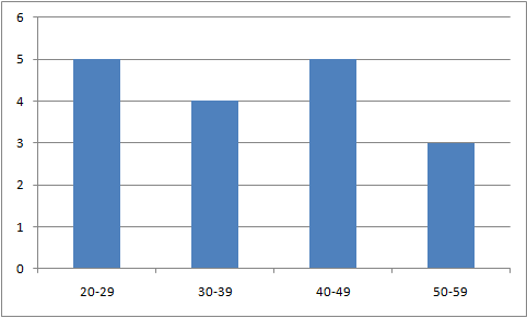
eg. the numbers 20, 23, 25, 26, 29, 32, 35, 38, 39, 40, 40, 42, 44, 48, 50, 51, 53 are put into groups and displayed below as a bar chart
The same data displayed as a stem and leaf looks like this...
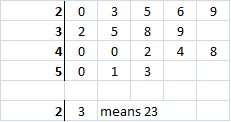
The stem and leaf has "bars" of numbers running horizontally. Notice that the lots of information is lost when we draw the bar chart, but all the actual numbers are still visible in the stem and leaf.
Back-to-back stem and leaf diagrams allow us to make comparisons between 2 sets of data such as heights of men and women.
Box Plots
Box plots (sometimes called box and whisker plots) allow us to compare visually different sets of data. They involve taking all of the data and stripping it to the bones to leave just 5 important values:
- smallest value
- lower quartile
- median
- upper quartile
- greatest value
All of the actual numbers are lost, but what we gain is a sharper diagram that focusses on some important statistics. The important bits are the central values and these get a "box" bit of the plot - the more extreme values are represented by lines, or whiskers. For the data in the stem and leaf section we have:
- smallest value = 20
- lower quartile = 29*
- median = 39
- upper quartile = 44*
- greatest value = 53
* see quartiles for explanation

Looking at the plot we see four sections (two whiskers and a central box divided into two). Each section should contain the same amount of data. In our example there are 17 numbers, so each section of the box plot has about 4 items of data. Notice that the third section (the second bit of the box) is smaller than the others - yet it still contains about a quarter of the data. This means that the data are more closely packed. This diagram shows stars where the actual data are.

Measures of Location
A statistician tries to represent huge amounts of data with just a few important numbers, or statistics. This will enable her to compare sets of data using mathematical techniques. One really important statistic is a number that represents a typical value in our data. This number is called the average and can be found in a variety of ways. We will concern ourselves with three of the most popular ways to represent a typical value: mean, mode and median.
The Mean
The Median
The median is the central value. If there are an even number of observations, then the median is half-way between the two central values (the mean of them).
The median is quite easy to find for discrete data, but can get a bit tricky if the data is grouped (or continuous)
The position of the median is easily found from the number of observations in your sample. In general, if there are n observations arranged in increasing value, the median is in position ½(n+1). If this is not a whole number then the median is half-way between the two values on either side.
In this new version of our stem and leaf diagram, I have added a number on the end to represent how many values are in each row. The red 17 is the total number of observations.
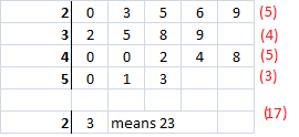
This helps us to find the median more quickly, especially when there are a lot of values. The median is in position 9. I could count until I got to the ninth number, but if the median was in position 259 I'd like a faster method than just counting.
This next version has a cumulative count of the data and will prove very useful for large data sets.
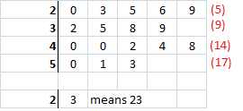
We can now tell that numbers in positions 1 to 5 are in the first row (I know that you can see this easily but just pretend that the amount of numbers is too large to count easily). Numbers in positions 6 to 9 are in row 2. Positions 10 to 14 are row 3 and 15-17 make row 4.
We said earlier that the median was in position 9, so is in row 2. It's the last value in this row - 9.
The Mode
This is just the most frequent observation. If the data is put into groups (such as continuous data is) then we cannot find the mode as we have lost information about the exact values. In this case we find the most frequent group and call it the modal group.
The mode is really easy to find and might have occasional uses, but it doesn't lead to much.